Urban Blight or Beauty
This week I had the opportunity to shoot an abandoned building in Philadelphia for a company that is trying to rebuild parts of the city that have been forgotten and almost discarded completely. This group led by Ken Weinstein, has the goal of bringing life back to some of the areas in the city that are in decay and seem to be fading away. I spoke with Ken a couple of weeks ago at Moonlight Movies (sponsored by http://gomtairy.com and mentioned in my post last week) in my neighborhood and he mentioned that he had another building that he just acquired. The following Monday I was on the phone talking to his assistant Noah to find out when I could get in and photograph the location. We set a date for this past Monday and the wheels were in motion.
Whenever I am shooting for www.phillyofficeretail.com I don’t know what I am walking into but this time Noah was saying that the space has many interesting spaces and odd corners, rooms and interesting spaces. Was he ever right! This space has so many different layers I could have stayed for a week and never stopped discovering interesting angles and textures. My main goal in this building was to document the space so that when Philly Office Retail looks at the images it can show them where they need to do work and how they can maximize the use of the space for any businesses moving in once the space is restored.
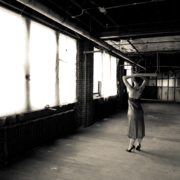
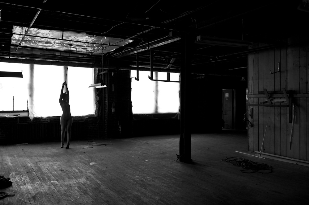
In addition to documenting the space I wanted to bring in a model so that I could take this opportunity to create some images that I have long been imagining, a dirty, run down space with wires exposed and rooms in disarray but in the middle of it all, a well-dressed woman. In my mind the contrast would be wonderful. What do you think? Does it work?
The images you see here are only 2 of almost 1500 images I created. These were both taken in the same space on the second floor of the main building. These images were created as you see them, no Photoshop and the only manipulation of the images is the conversion to black and white. This is the type of space that is made for this photographer’s idea of a studio. Huge natural light pouring in from one side yet dark on the other made this a perfect space to shoot. Between the space, the model and the wonderful light I was able to create in a way I have dreamed of for a while.
As I was reviewing this images I got an email notification that a new topic of discussion was posted on my LinkedIn group Photography: Clients and Professionals Networking Group, “Urban Beauty.” In this article Jon DeVaul discusses how in Photoshop he adds some skies to his images to make his images of some fairly stark power lines more interesting (you can see the images on his blog here: Jon’s Blog) and in fact they are really great looking images. However I think I found an easier way; just add a model and see how that perks up the urban environment.
Jon, feel free to pipe in here. 😉


Hey Michael, I can always add them in later! :D. Nice images here…something about those old buildings!!