First Impression… or Last
Just the other day I received a connect request on LinkedIn from someone I didn’t recognize. At first I thought it may be SPAM but I took a look anyway. I get a lot of connect requests because of the groups I own and manage on LinkedIn, the group I created is “Photography: Clients and Professionals Network” and is geared to the professional photographer and anyone that at some point, hires a photographer. I thought maybe this person found me through that group.
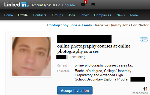
The person trying to connect was also trying to sell me online photography courses which I found a bit odd. I took a look at the person’s profile image. The image was blurry, washed out, cropped way too close, and flat looking. Really? You can’t post a decent image of yourself but you can offer me online photography courses? Do you really think that anyone is going to give you the time of day when your profile image that bad? This image was bad too, take a look for yourself below.
Needless to say this brought all the bad profile images I have seen over the years, the ones with the wife or girlfriend cropped out, the bad cell phone images, images of someone holding a drink, the ones where the person is just a tiny dot in the distance (yeah that looks great as a 150×150 image) rushing back into my mind! These images are ‘fingernails down a chalkboard” for a photographer and this guy just brought them all back in a split second (shiver).
So what is a good profile image? For starters it should be in focus; if your image isn’t in focus, then how will I know if you have the focus to teach me anything? I can go for hours, possibly days on what a bad image is but rather than ramble on let’s ask what is a good image.
A good profile image is at least a good representation of what you look like so that when you go to a networking event or a business meeting with a potential client, or even just talk on the phone, other people will recognize you and know what you look like. Granted 150 pixels square is not a whole lot of space to work with but if you can create an image that also says what you do, even better. Many photographers have images of them with a camera in front of their face, I even did for a while, but truth be told, this is a bad idea. Holding a camera is plenty; remember I need to know what you look like.
If you are a car salesman perhaps you should be leaning on a bright shiny new car, or if you are a banker, in front of your company logo, a doctor may want to have a stethoscope around their neck, a scientist in a lab, anything that hints towards what you do. If what I am saying is true (and it is), then when I see a person that doesn’t take their profile image seriously I think they aren’t going to take me or my business seriously either.
Another consideration is that your profile image should be current, as in taken within the last 6 months to a year at the most. Keeping your image fresh means you care about how you appear to your potential clients. If you show me that you care about your business, then I am more likely to believe you care about mine too.
Facebook, twitter, your own blog or website are the same thing, keep it up to date, and keep it current. Just remember your profile image, no matter what social network it is, it may very well be someone’s first impression of you. Don’t let it be their last!
Like this post? Like it! Tweet it! Share it! Pin it! Stumble it! or Tumble it!


